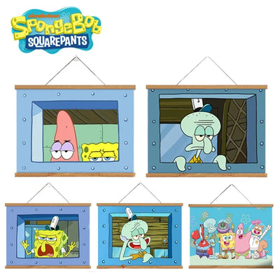
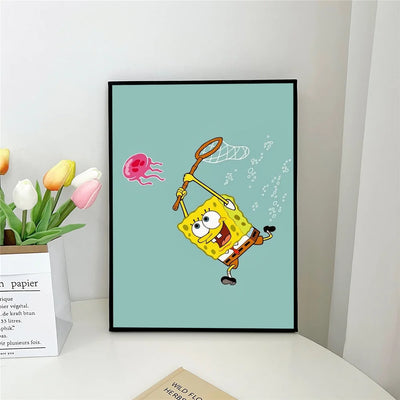
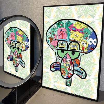
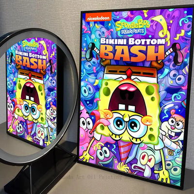
To decorate a bedroom with a SpongeBob poster, two settings matter above all: the size of the print relative to the wall, and its hanging height. Plan on 21 × 30 cm or 30 × 42 cm above a desk, 40 × 60 cm or 50 × 70 cm on a bare wall, and place the centre of the image between 145 and 150 cm from the floor.
The poster remains the simplest piece of decor for showing what you love. In fan culture it holds a special place: part decor object, part identity marker, part collectible. SpongeBob posters are no exception. This guide focuses on the bedroom: it is the room where you have the most freedom, and the one where format mistakes show up most. For a room-by-room approach across a whole home, read our guide to SpongeBob apartment decor for adults instead.
🖼️ The different types of SpongeBob posters
There are four broad families of artwork, each with its own uses.
Figurative prints faithful to the show — These are the visuals closest to what you see on screen: full-length characters, saturated colours, clean outlines. They work well in a child's or teenager's bedroom. Useful note: boutique-bobleponge.fr is an independent shop with no connection to Nickelodeon or Paramount, and sells no licensed merchandise.
Art prints — Illustrators reinterpret the characters in their own styles: vector illustration, watercolour, 1950s retro, minimalism. These prints give you a styled wall rather than a merchandise wall, which makes a big difference in an adult bedroom.
Typographic posters — Prints built around a single line, in strong graphic design. They work well above a desk, where you want a note of humour without overloading the room.
Panoramic compositions and mosaics — Wide visuals gathering several characters or an overview of Bikini Bottom. Below 40 cm wide the details become unreadable: keep them for 40 × 60 cm and 50 × 70 cm.
📐 Choosing the right size
Size depends on two things: the available wall width and the distance from which you look at the print. A simple rule: a poster ideally covers between 55% and 75% of the width of the furniture it hangs above.
The table below lists the five sizes actually offered in our SpongeBob poster collection, with the recommended viewing distance and the spot each one suits best in a bedroom.
| Size | Dimensions (cm) | Recommended viewing distance | Spot in the bedroom | Observed price |
|---|---|---|---|---|
| Postcard | 10 × 15 | 30 to 50 cm | Shelf, bedside table, inside of a wardrobe door | €22.90 |
| Close to A4 | 21 × 30 | 1 to 1.5 m | Above a desk, in a row of three | €22.90 |
| Close to A3 | 30 × 42 | 1.5 to 2 m | Side wall, door reveal, corner of the room | €22.90 |
| Large | 40 × 60 | 2 to 2.5 m | Above the bed, centrepiece of a gallery wall | €22.90 |
| Extra large | 50 × 70 | 2.5 to 3.5 m | Bare wall facing the bed, main wall section | €22.90 |
One point deserves attention when you buy the frame. ISO standard sizes measure exactly 21 × 29.7 cm for A4, 29.7 × 42 cm for A3, 42 × 59.4 cm for A2 and 59.4 × 84.1 cm for A1. Our 21 × 30 cm and 30 × 42 cm are therefore very slightly taller than an A4 and an A3: an off-the-shelf A4 or A3 frame works, but it crops 2 to 3 mm at the bottom. If you want zero cropping, take the next size up with a mount.
Watch out too for 30 × 40 cm, one of the best-selling frame sizes in high-street shops. It is not the same as 30 × 42 cm: the 2 cm missing in height force you either to trim the print or to let it buckle. Always check the exact size printed on the back of the frame before paying.
Our pick of SpongeBob posters
Four visuals that hold up from 21 × 30 to 50 × 70 cm 🌊


🎨 Building a gallery wall in a bedroom
The gallery wall — several prints grouped on the same wall section — works well in a bedroom because it fills the surface without forcing you to drill one very large hole. Here is how to compose it without going wrong.
Mix the sizes — A good composition plays on a hierarchy of sizes. Start with a 40 × 60 cm centrepiece, surrounded by two or three 30 × 42 cm, punctuated with 21 × 30 cm. That variation creates rhythm and avoids the catalogue effect.
Count in odd numbers — Three, five or seven frames read better than four or six. An even number pushes the eye to look for perfect symmetry, and the slightest offset shows.
Keep the spacing constant — Leave 5 to 8 cm between two frames. Below 5 cm the group looks compressed; beyond 8 cm the frames stop being read as a group. Keep the same gap everywhere, horizontally and vertically.
Pick one reference line — There are only two options, and you must choose one: either you align the top of every frame, or you align their horizontal centre axis. Mixing both logics gives a composition that looks off without anyone knowing why.
Pick a consistent style — The composition works better when every element shares something: the same palette, the same graphic style, or the same group of characters. Mixing a pastel watercolour with a heavily saturated visual often gives a disjointed result.
Plan on the floor before hanging — Lay all your frames on the floor in the intended layout before drilling anything. Another method: cut kraft paper templates to the exact dimensions and tape them to the wall for two days.
🖼️ Framing: which frame for a SpongeBob poster?
A beautiful visual in a mediocre frame loses its impact; a simple visual in a good frame takes on another dimension.
The thin black frame — The most versatile. It disappears behind the artwork and handles the very saturated colours of the Bikini Bottom world well.
The white frame — Airier, it suits bright bedrooms and shows off pastel backgrounds. Avoid it in a dark room, where it quickly looks dull.
The natural wood frame — Warmer. Light wood goes with Scandinavian decor, and the yellow of the main character sits naturally alongside it.
The mount — This card surrounding the image gives a gallery feel and makes the print look bigger. It also solves the size gap: a 30 × 42 cm in a 40 × 50 cm frame with a mount needs no trimming at all.
Glass or acrylic — In a child's bedroom, prefer acrylic: it weighs two to three times less and does not shatter. On a 50 × 70 cm above a bed, that is a genuine safety criterion.
📏 Hanging a poster: height, paper and fixings
This is the step people rush most often, even though it decides the final result.
Hanging height — The reference rule, used in museums, places the centre of the image between 145 and 150 cm from the floor, which is the average eye level of a standing adult. You measure the centre of the frame, not its top edge: that is the most common mistake, and it lifts the print 20 to 30 cm too high.
Above a piece of furniture — The 145-150 cm rule only applies on a bare wall. Above a desk, a chest of drawers or a headboard, leave 25 to 30 cm between the top of the furniture and the bottom of the frame. Below 25 cm the print looks propped on the furniture; beyond 30 cm the visual link breaks.
In a child's bedroom — Adapt to the occupant's height: a six-year-old has eye level around 110 cm. Dropping the centre to 120-125 cm stays coherent, provided the whole wall follows the same logic.
Paper weight — A standard print is produced on 170 gsm, which is enough for a poster framed behind glass. For a print that will be handled, pinned up or displayed without a frame, aim for 200 to 250 gsm: the paper stands up on its own and buckles far less.
Matte or glossy — Gloss saturates the colours but bounces light back. In a bedroom with a window facing the wall, a matte finish is the rational choice: it removes reflections and keeps the print readable from every angle. Save gloss for side walls with little exposure.
Fixings that cause no damage — In a rental, drilling is not always an option. Three solutions work. Repositionable adhesive strips come off by pulling the tab and leave neither hole nor mark, up to around 2 kg depending on the model. Adhesive hook-and-loop strips hold light frames and let you take them down without tools. Frames hung from an existing picture rail or rod never touch the paint at all. In every case, dust the wall before sticking, and wait an hour before loading it.
What actually damages a print — Direct sunlight is the leading cause of fading: the inks yellow and the blues go first, sometimes within a few months behind a south-facing window. A wall that never gets direct sun is the best spot; failing that, UV-filtering glass slows the process considerably. Damp comes next: avoid the wall shared with a bathroom.
💡 Theme ideas for a SpongeBob bedroom
To go further than a single print, here are three coherent directions.
Ocean and underwater theme — A palette of blues, greens and turquoises, with nautical elements: shells, netting, starfish. The yellow of the main character stands out all the better against a blue wall.
1990s retro theme — Saturated palette, old-school graphics. Visuals inspired by the early seasons have that aesthetic; complete it with colourful furniture.
Modern minimalist theme — Prints in black and white or two colours. These pared-back versions of the characters fit into an adult bedroom without turning it into a nursery. It is the safest option if you share the room.
To build a full set, browse the SpongeBob poster collection: the five sizes are available on most visuals, which lets you build a consistent gallery wall.
❓ FAQ
Which size should I choose?
Start from the width of the surface. Above a 120 cm desk, a single 21 × 30 cm looks lost: take a 30 × 42 cm, or three 21 × 30 cm in a row. On a bare wall over 2 m, move up to 40 × 60 cm or 50 × 70 cm. The 10 × 15 cm is made for a shelf, not for a wall. Our posters are the same price of €22.90 in all five sizes.
At what height should you hang a poster?
On a bare wall, place the centre of the print between 145 and 150 cm from the floor, which is average eye level. Above a piece of furniture, forget that rule and instead leave 25 to 30 cm between the top of the furniture and the bottom of the frame. In a child's bedroom, drop the centre to 120-125 cm.
How do I fix it without damaging the wall?
Repositionable adhesive strips are the most reliable solution in a rental: they come off by pulling the tab, with no hole and no paint torn away, and hold around 2 kg depending on the model. Adhesive hook-and-loop strips suit light frames. An existing picture rail lets you hang without touching the paint. Clean and dry the wall before sticking.
Is it better to buy a poster framed or unframed?
Our posters are sold without a frame. That is also the most flexible choice: you pick a frame that suits your bedroom and you change the artwork without buying the framing again. Just budget for the frame separately and check that its dimensions match the size ordered exactly.
How do I stop the colours fading over time?
Keep the print away from direct sunlight, the main cause of yellowing. On a heavily exposed wall, UV-filtering glass slows the fading considerably. Also avoid damp walls.
Can a SpongeBob poster suit adult decor?
Yes, provided you pick the style. A pared-back two-colour visual, in a thin black frame, reads very differently from a heavily coloured figurative print. Size matters too: a 30 × 42 cm blends into the room, whereas a 50 × 70 cm sets the tone.
What are the delivery times and costs?
Delivery costs €5.90 in France and the European Union, and is free from €60 of order value. Outside the European Union it is charged at €7. Allow 7 to 14 working days for arrival.